In a market flooded with cold, technical car parts platforms, Ottogusto set out to do things differently. With over one million OEM car parts and a mission to serve everyone from first-time wrenchers to seasoned mechanics, the brand needed more than just functionality — it needed to embody the pride, precision, and personality of car culture itself. For true enthusiasts, working on a car is a deeply personal act: it’s about independence, recognition, and belonging to a community that still values skill, grit, and the satisfaction of getting your hands dirty.
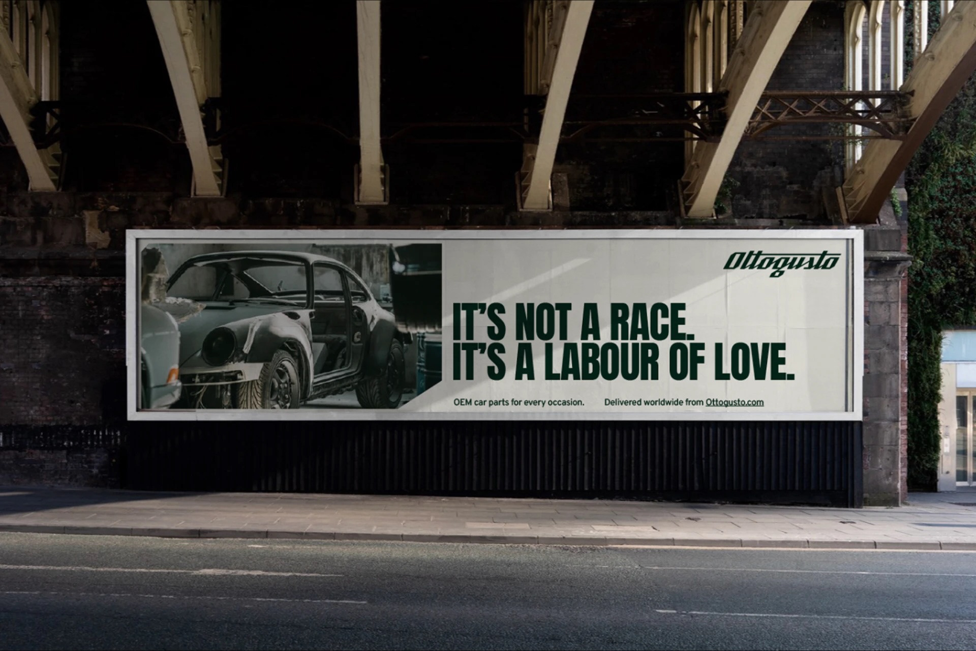
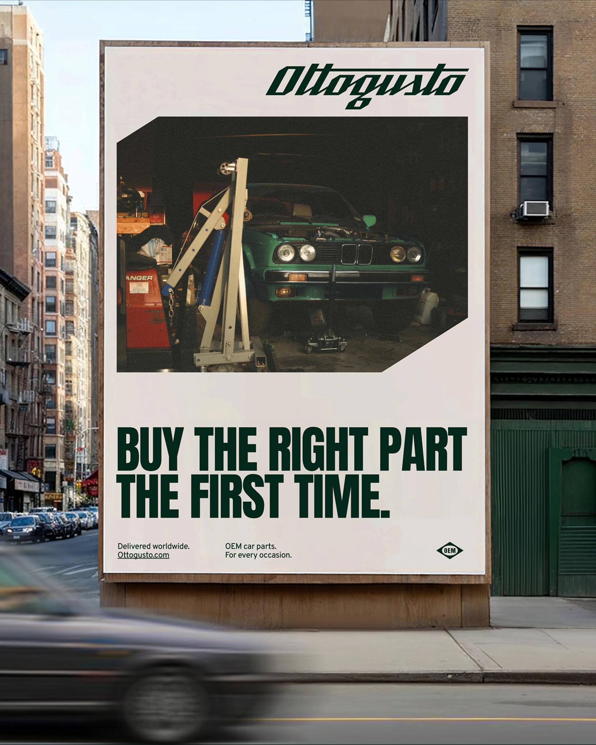
We positioned Ottogusto as a partner in parts and passion, a brand built for people who take control and take pride in doing the job right. The name brings a touch of Italian flair, nodding to the near-mythical status of Italian car marques while hinting at the joy and gusto of the work itself.
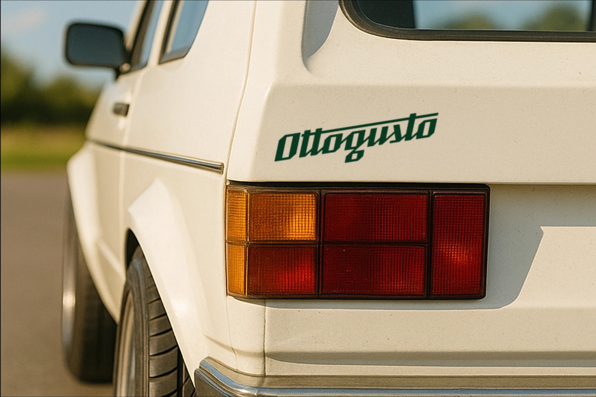
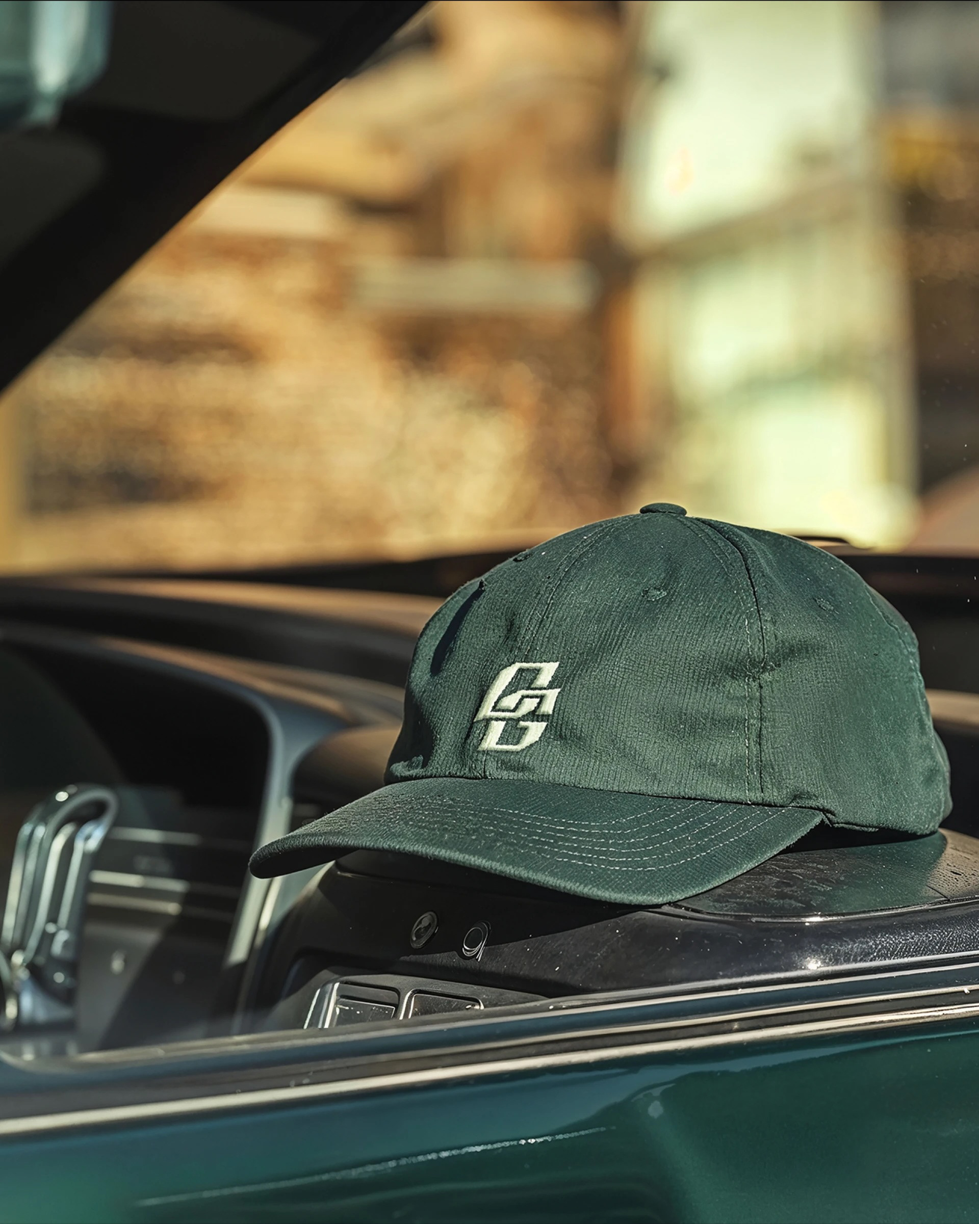
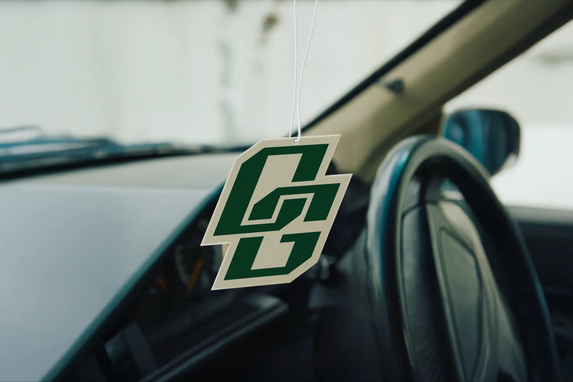
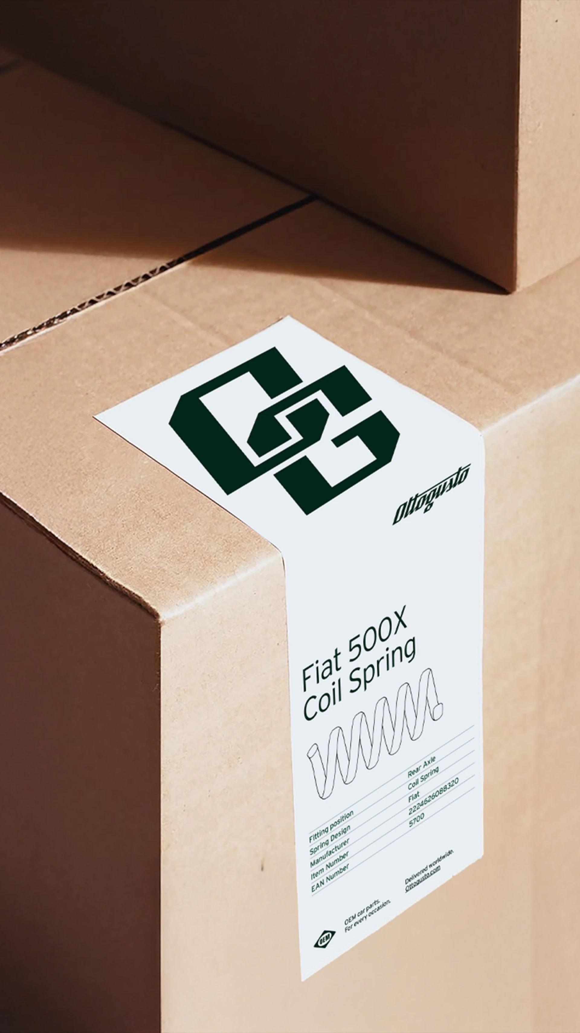
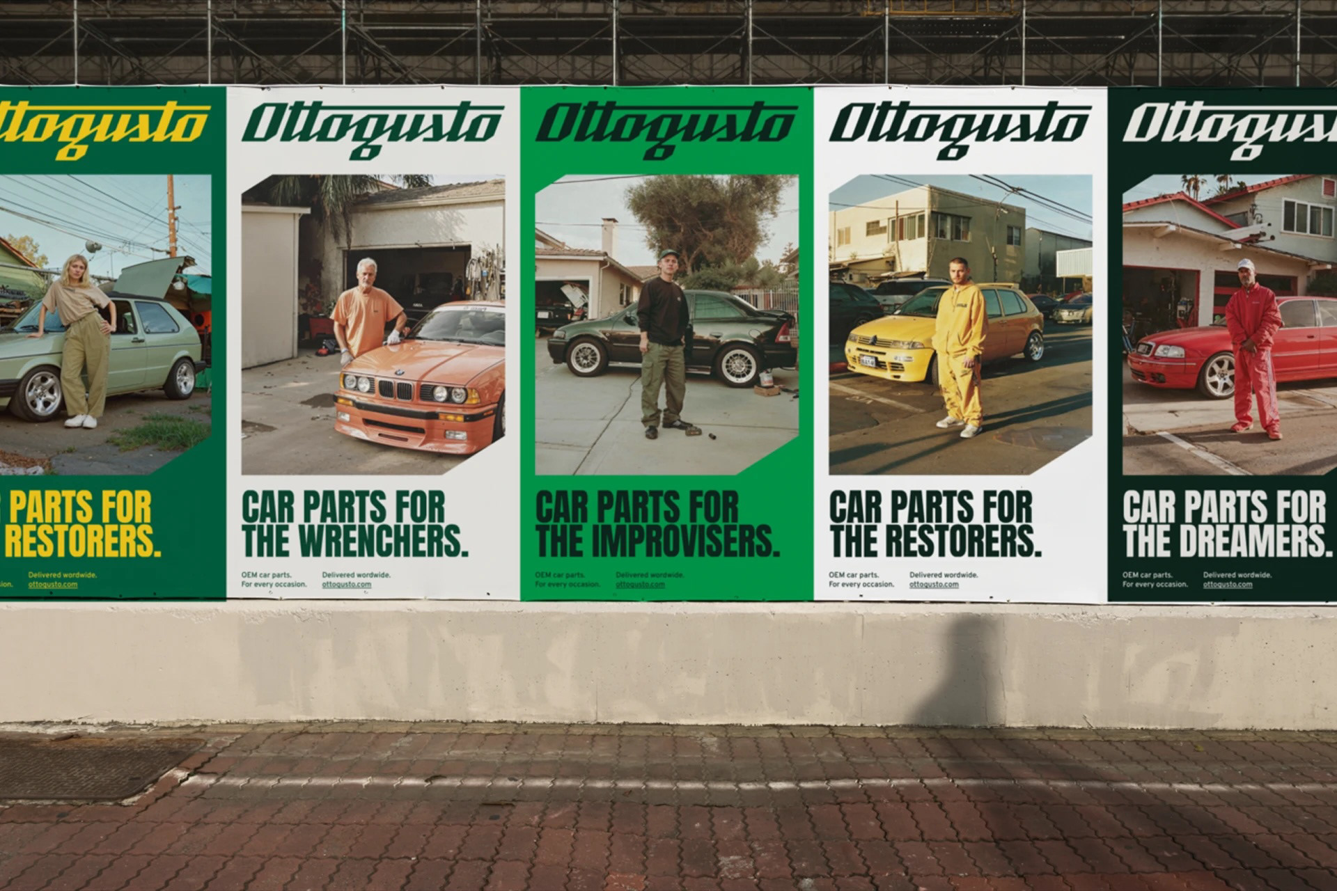
Ottogusto serves tinkerers, tuners, restorers, and revvers alike and the visual identity is a celebration of that individuality inspired by the sleek confidence of chrome emblems, the clarity of workshop manuals, and the no-nonsense codes of garage culture. The gold wordmark evokes classic automotive badging, while the color palette draws from motoring heritage — a deep racing green contrasted with a bright, high-visibility yellow reminiscent of highway signage. Together, they combine elegance with utility.
Ottogusto doesn’t just help cars run — it celebrates the stories, skills, and pride behind every build. In a category dominated by anonymity and sameness, it puts control, quality, and individuality back in the hands of the people who care most.


Project carried out in collaboration with the "We Want More" studio of Antwerp